
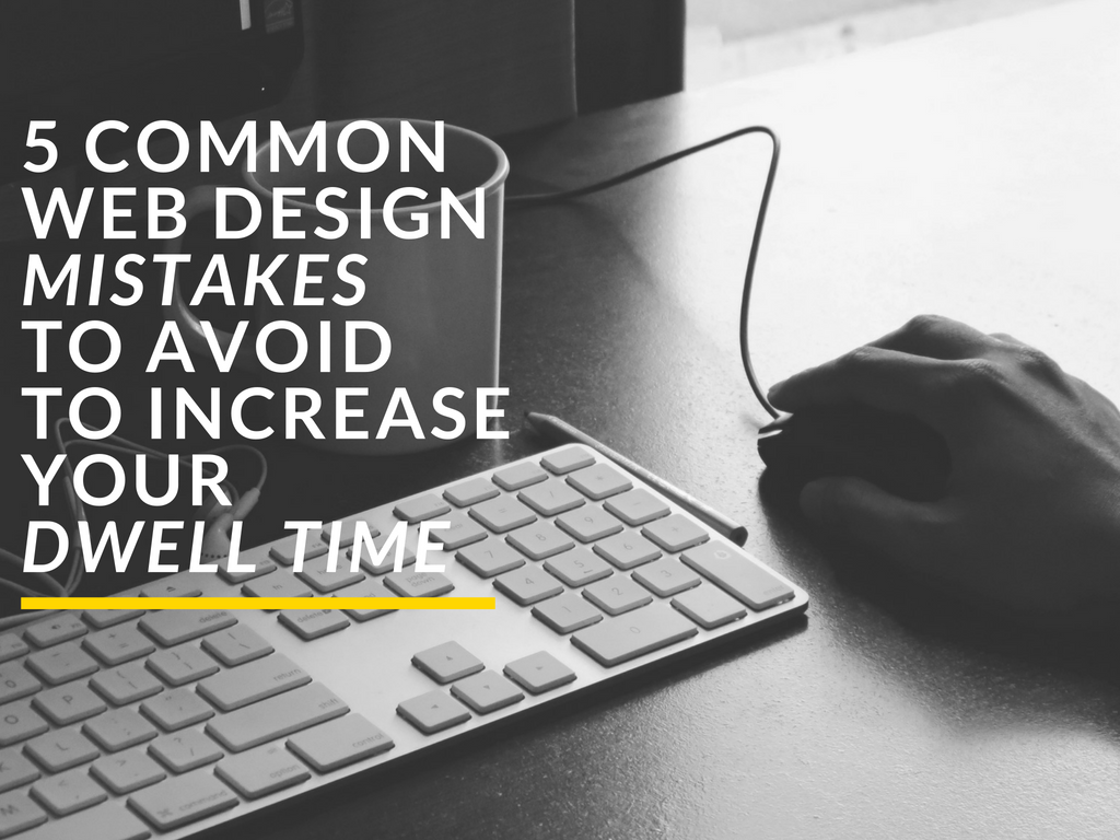
The recent major shift in browsing practices, which has now become mobile-centric, created a wave of website redesign among brands. While this phenomenon gave birth to interesting new design options such as parallax scrolling, it has also allowed poor web design builds to permeate, creating a fragmented user experience that hinders a genuine connection from being established by the brand to potential customers.
From a visually appalling layout, poor content, and bad navigation, sub-standard website design can be improved and avoided to create a pleasing browsing experience and prolong the time a visitor spends on your website. Below, we listed 5 common web design mistakes that you should avoid in order to increase dwell time on your website.
Failing to Use Responsive Web Design

Back in 2016, mobile search percentage per industry was already at 72% for food & beverage, 68% for health and sports, and 64% for news & media. These are way beyond half of the total traffic for each industry. Let’s not look far: just think about your own web browsing habits. How often do you use your phone or tablet to search online? This means it’s imperative for your website to be responsive when accessed from both a desktop and a mobile device. Not to mention, your website might actually get penalized as Google cracks down on websites that are not mobile-friendly.
Placing Bad Pop-Ups

Let’s set things straight: When used strategically, pop-ups can be leveraged as a great tool that can support your website’s remarketing efforts and can be a great spot for your advertising partners. However, excessive and irresponsible use of pop-ups can drive your visitors away.
Always remember that your website visitors are on your website for a reason. They’re interested in the content they’re trying to read, view, and access, so give them time to enjoy what they came for first. Imagine having to be blocked by a pop-up window right on the first second that you land on a website, isn’t this frustrating? If your visitors are pleased with what they see, they’ll most likely hang around a few more minutes and click on other stuff before leaving your website. By this time, you already have their attention, the perfect time to release your pop-up window. In essence, pop-up windows aren’t bad, but putting it out as the very first thing can come off as desperate and senseless for your visitors.
Making Your Website’s Navigation Complicated

Having an organized website makes happy visitors which can turn into long-lasting viewers. On the other hand, a poorly-constructed website that has poor organization will definitely confuse visitors, leading them to stop browsing or restart their search for a better website.
Website navigation is a simple yet important feature of any website. A navigation bar, which should house your pages per category, is usually visible throughout your website. This allows your visitors to get right to which page they need to access. By cutting down your customer’s journey within your website, you’re also shortening their buying path, which may help push them into conversion at a much faster rate.
Make sure to reflect all the information on your website into the navigation bar to make all the pages accessible. A properly-labeled and identified navigation will also help your website’s searchability, so make sure this is properly done.
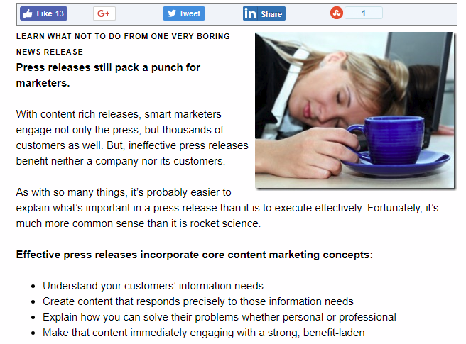
Adding Poor Images to the Site

When we talk about website design, its visual appearance comes first in mind – and for good reason. What we see has a great impact on our first impression, especially on websites. A website with poor images or those with highly-generic stock photos can leave a cheap impression for visitors. For well-versed visitors, this can imply that your company hasn’t given much thought to design and branding, or does not pay attention to detail at all.
You don’t want to get this kind of the first impression.
It’s important for your team to come up with a well-designed website that uses high-quality graphics and images that’s consistent throughout your web pages. Your creativity and originality will help your website create a lasting impact on your visitors.
Posting Bad Quality Content
Okay, we’ve heard it time and time again, but let me say it one more time: Content is King.
Your website’s content remains to be the most important feature for your website’s ranking and uniqueness. Good content will keep your visitors coming while keeping them entertained and engaged at the same time, which can drastically help improve your website’s dwell time and subsequently, your search ranking as well.
Look, great content doesn’t stop at writing crisp and awe-inspiring articles. You should make it a point to update your website content from time to time in order to stay relevant. People hate seeing outdated information, especially for e-commerce platforms. This creates an impression that your website isn’t regularly maintained and that it’s not being taken care of.
Give your visitors more reason to come back by creating inspiring content that connects with them on a personal level.
Author Bio:
Kenneth Sytian is a web developer in the Philippines and CEO of Web Design Company Sytian Productions. Keeping up with industry trends, Kenneth and his team has been designing websites and developing web apps for more than a decade.