
Whether you’re just starting out in business or are well recognised, you’ll have already have heard just how important branding is and how crucial it is to get right the first time. If you want to succeed in branding you have to understand the wants and needs of your customers and prospective customers. Do this by integrating your brand strategies throughout your company at every point of contact with the public – from your letterheads to your exhibition stands and trailers.
A durable brand is priceless as the fight for customers intensifies day by day. It’s important to invest time in researching, defining, and building your brand. After all, your brand is the source of a promise to your consumer. It’s a foundational piece in your marketing communication and one you don’t want to be without.
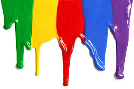
Colour and branding have always been inherently linked. Colours have meaning and have been scientifically proven to stimulate feeling and emotions. With this in mind, the choice of colour for a brand is undoubtedly vital to the success of the product. You want a colour that will mean your customers know you’re there the minute they walk into the trade show. There are many big name brands that are recognised as much for the colour scheme used as their distinctive logo.
Cadbury
Admit it, when you see that Cadbury purple you know that you’re about to be in chocolate heaven. The link between branding and colour is one of the strongest – you don’t think Cadbury without thinking of that royal purple do you? Well, recently there was a dispute between the two biggest chocolate companies in the UK; Cadbury and Nestle. Cadbury won the right, in the high court, to use Pantone 2685C purple exclusively. Nestle challenged this, stating that colours could not be used as trademarks. Cadbury have used this shade of purple for over 90 years, but still had to fight for 4 years to achieve this result. They claimed that purple has an association with decadence, luxury, royalty and quality. As chocolate was once an expensive thing that only the rich could afford on a regular basis, the colour purple added the perception of high value to the brand. Therefore Cadbury chose the colour in 1914 hoping that its regal associations would improve the indulgent experience of eating their chocolate. So it’s no surprise that Cadbury is now known as the King of Chocolate.
Coca-Cola
Everyone’s heard of Coca-Cola. More commonly known as Coke, with a variety of different flavours now being added on the market, from Coke Zero to Diet Coke. You can’t deny that it is the world’s most popular soft drink and it is sold in over 200 countries worldwide. The original use for Coke was as a medicine, when it was invented by John S Pemberton in the late 19th century. Coca-Cola is one of the most recognised brands in the world. The red and white colour scheme was designed to attract young people to the product and the curved bottle has come to symbolise the youthful energy of America. The colour red is bold, and it represents excitement, youth and stimulates the appetite. For this reason it is often used to represent food and drink brands. The Coke logo has constantly evolved over the decades, but has remained true to its core design whilst appearing up to date. It is used on all their marketing collateral from the website and TV adverts to posters and feather flags. Not to mention that in the traditional Coca-Cola Christmas advert, the theme song titled Holidays Are Coming has re-appeared in all of the ads since the 90’s, which has helped to keep the legacy of the original advert alive.
Tiffany
The Tiffany blue is a characteristic as the jewellery. What woman wouldn’t want one of those trademark blue bags with the same blue box tied with a white satin ribbon inside? The packaging screams luxury, exclusive and quality at a glance. The iconic robin egg blue speaks volumes to their target audience and they know not only is there a product of high value within the package but that they are buying part of a quality brand that they trust. Tiffany’s Blue Book was first published in 1845 and was (and still is) an annual showcase of their range. It used the colour on its cover and it has been used on all of their promotional materials ever since. It is a custom colour by Pantone with the reference number 1837 derived from the year Tiffany & Co started out. Tiffany’s colour is also trademarked so it is not publicly available or printed in the Pantone reference books.